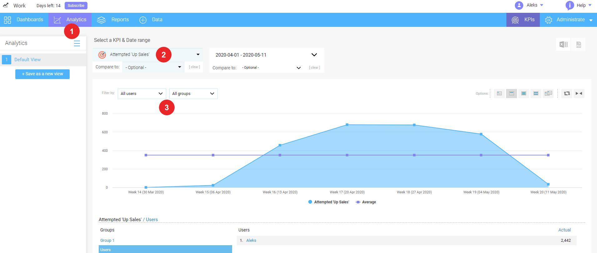
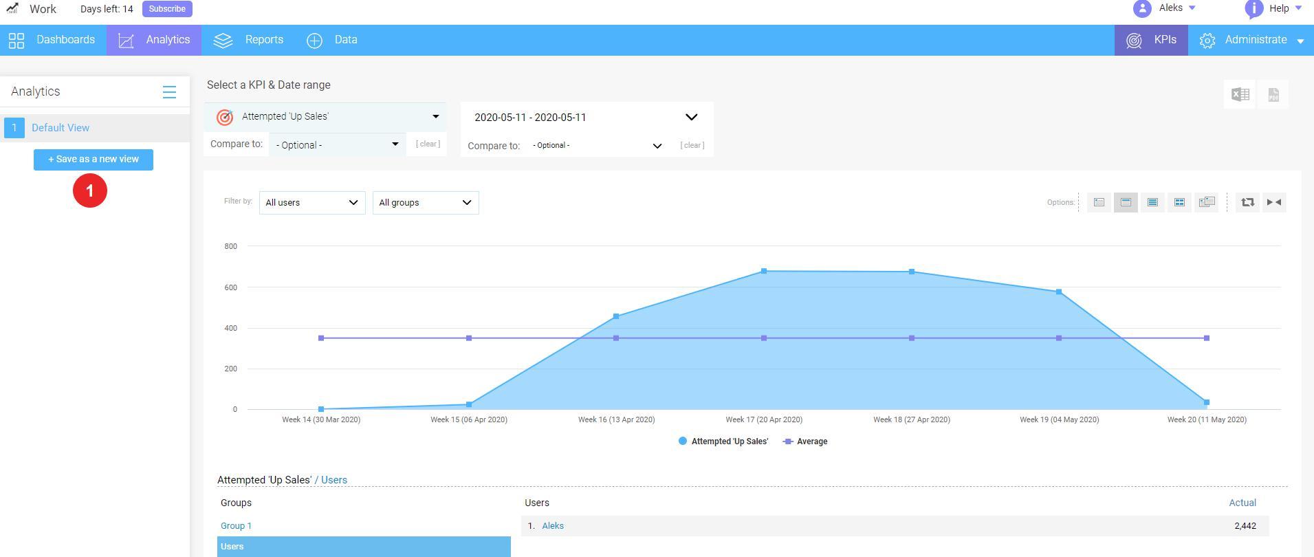
Select a primary KPI from Select a KPI & Date range drop-down list. The analytics by default will display the accumulated (or average, depending from KPI settings) users data value of KPI you have selected. Feel free to filter the data by individual users or groups;
Click User or Group drop-down menu and then choose the user or group you want to filter by (To clear this filter, simply remove the values in the filter drop-down menu and click Done);
Note: If you wish to see actual figures on any of the graph periods, just move the cursor to the point on the graph.
Waytobi offers functional charts to visualize your data. You can access chart options on the top of the screen, thus you can modify chart views by choosing:
View Daily
View Weekly
View Monthly
View Quarterly
View Yearly
Change graph orientation by clicking Reverse Graph icon
Select Y axis as main by clicking Y axis icon
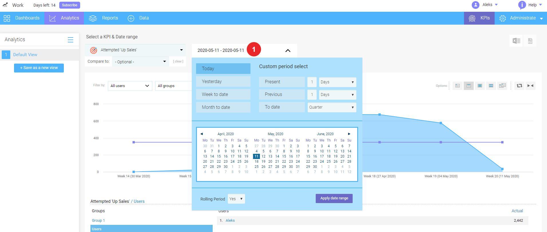
2. How to use date control
To select a standard date period, follow these steps:
Click drop down Date control menu;
Select a standard date period (after this, the report will automatically display the data for specified date period);
Click Apply Date Range.
To select a custom date period, follow these steps:
Click drop down Date control menu;
Select Start Date and End Date using left and right calendar controls;
Click Apply Date Range.
The chart will automatically display the data according to the chosen date range.
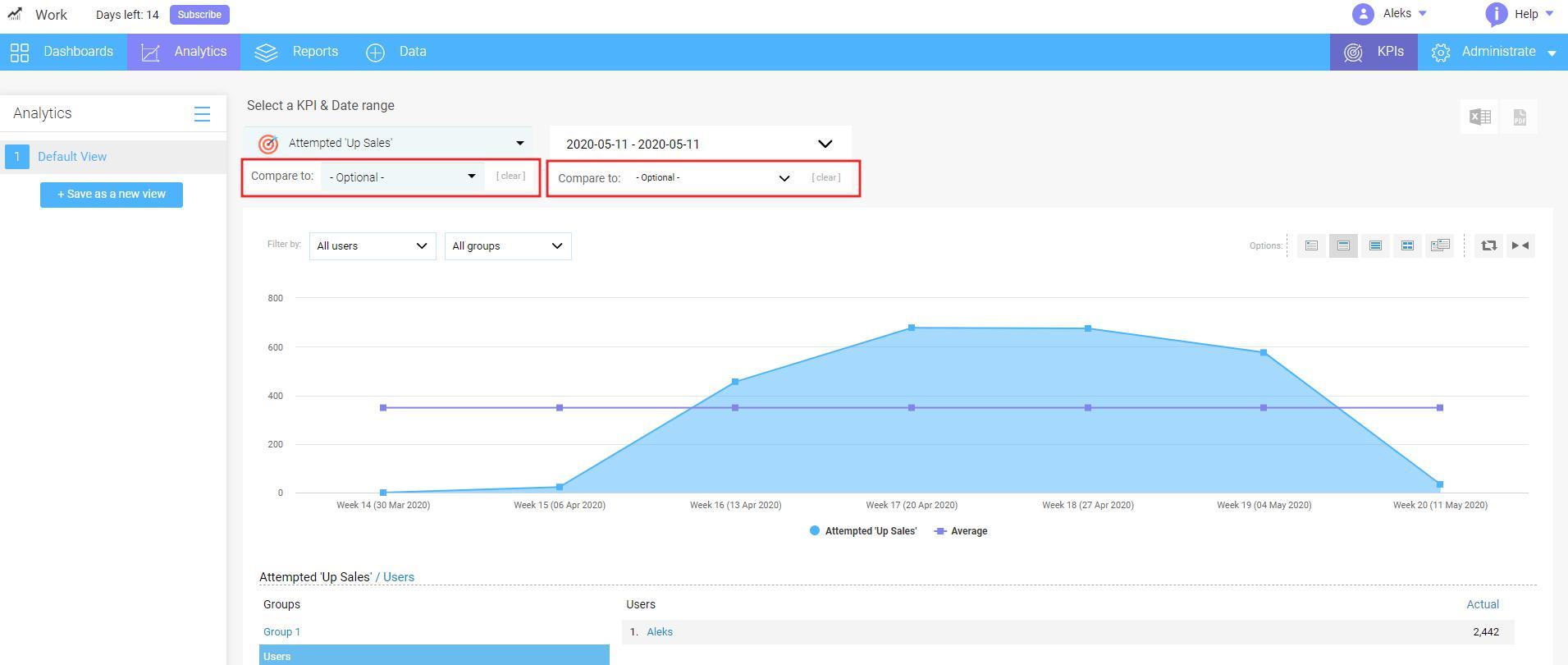
3. How to compare KPI's and dates
Waytobi has the optional drop-down menus for KPIs and dates. Using these menus, you can compare dates and KPIs against each other, and also compare the combination of the KPIs on the specific date periods.
To compare two different KPIs, follow the next steps:
Click Compare to drop-down menu and choose the KPIs you wish to compare;
Select primary date and compare date;
Click Apply Date Range (the chart should automatically update the data on the chart);
Clear your selection by clicking the Clear button.
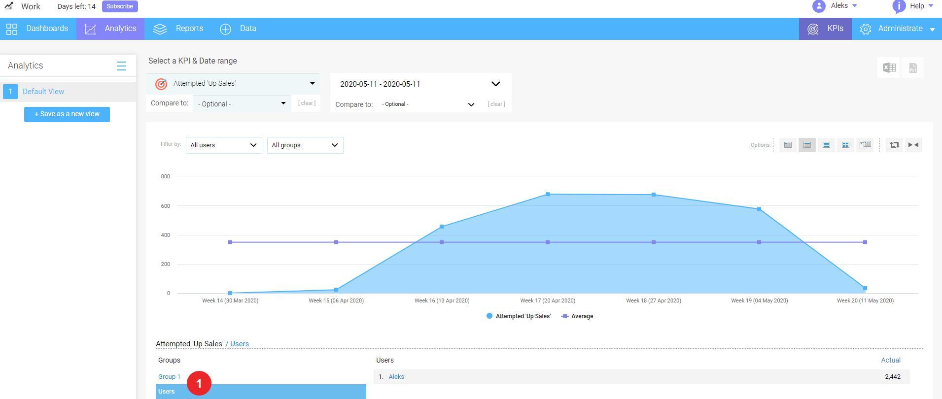
4. How to use filters and groups
Groups and users are listed in the area below the chart. To use this data:
Click the Group or Users in data listing. If you click the Group, you will be able to see all users within this group with their KPI data;
Click the breadcrumb icon next to KPI name to go back.
Note: Filters in this section apply only to data and have no effect on the chart.
5. How to save analytics views
To save an Analytics view, follow these steps:
Click Save as a new view button from the left side screen menu;
Enter the name for this view;
The new view will appear in the left side screen menu;
To remove or modify the view, move the cursor over the view name and click Edit or Delete icons.
Note: Click Save (Edit window) button each time you wish to apply the changes to the view.
Unable to find an answer?
Looking for anything specific article which resides in general queries? Just browse the various relevant folders and categories and then you will find the desired article.
Some of our site pages utilize cookies and other tracking technologies. A cookie is a small text file that may be used, for example, to collect information about site activity. Some cookies and other technologies may serve to recall personal information previously indicated by a site user. You may block cookies, or delete existing cookies, by adjusting the appropriate setting on your browser. Please consult the HELP menu of your browser to learn how to do this. If you block or delete cookies you may find the usefulness of our site to be impaired.
To know more about how our privacy policy works, please visit our website.